a. 500 Capp Street App
500 Capp Street, the David Ireland house, is one of my favorite contemporary museums in San Francisco. I decided to design an app for them when I noticed they don’t have one available.
App function: This app is mostly for booking visits to the museum. Users can browse past exhibitions and programs too.
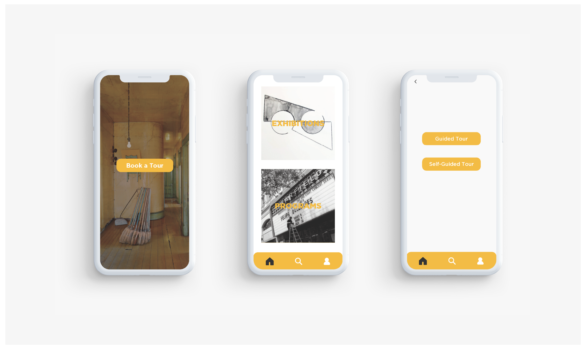
The museum has two major activities for their visitors: Visiting exhibitions and joining their programs. Once the app users click “Book a Tour” button on the landing page, they will enter the next page which offers two big buttons representing the museums two activities.
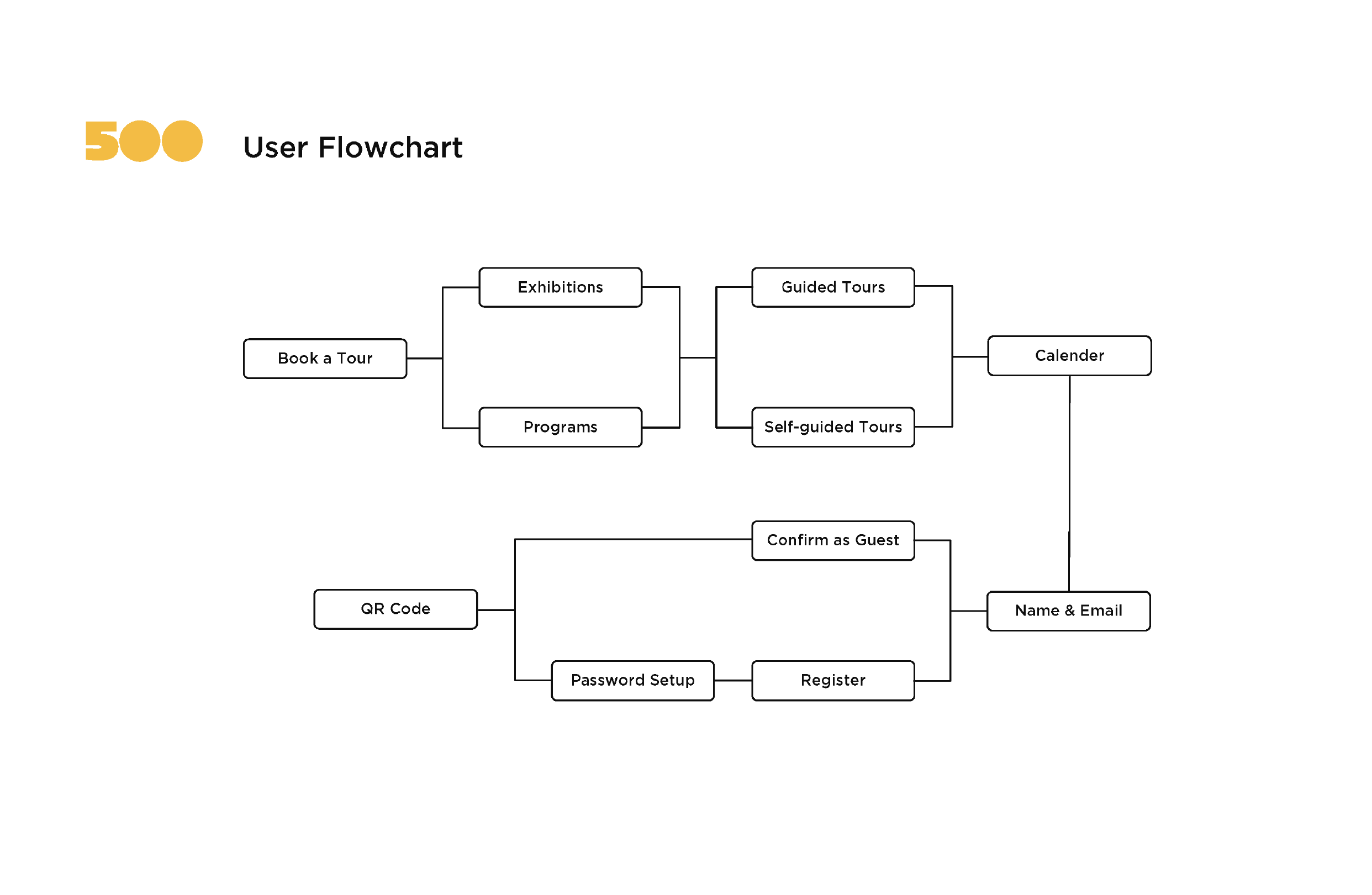
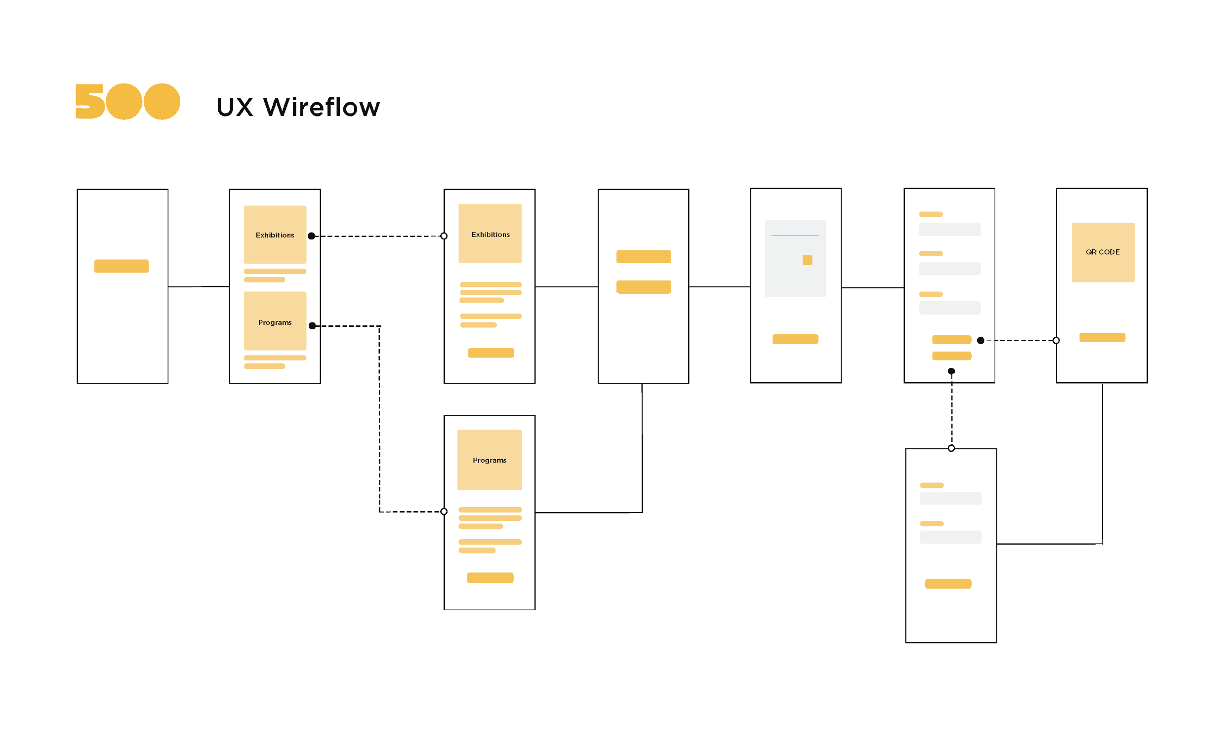
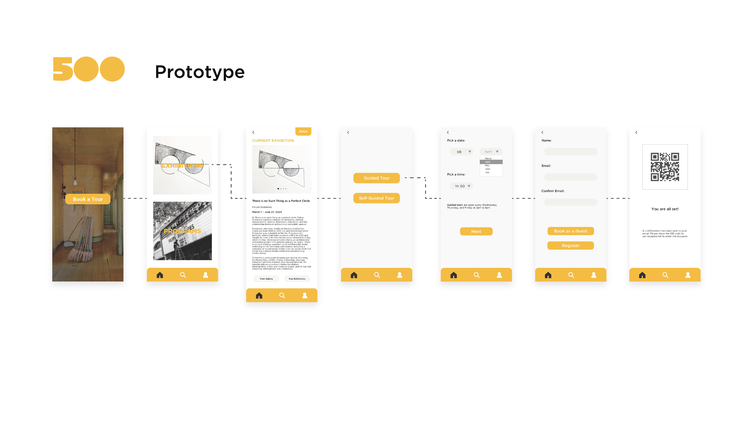
The prototype shows the flow process of a user booking a visit, assuming the user is booking an exhibition visit and chooses “Guided Tour” and “Book as a Guest”.
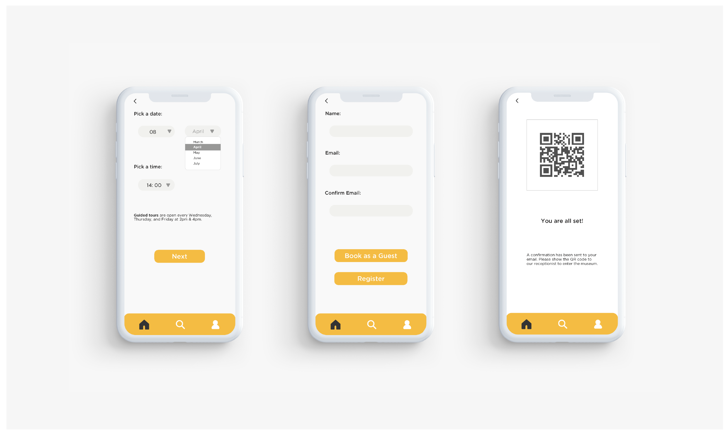
Challenge: The most challenging part of this app design is the calendar page. Since the museum is only open on certain days during certain period of time for each different exhibition. It will be confusing to using the traditional calendar display.
Solution: Using dropdown menu and let the users make choices from given dates and time.
What I Learned: I have only showed one stream of the possible flows of the user experience. An app can have as many possible sub-flows as the creators would like. But the most important thing is to cater to the users needs and experiences, as I did by creating only three flows: booking as the main stream and viewing gallery and past exhibitions as two sub streams.
b. 500 Capp Street Catalog
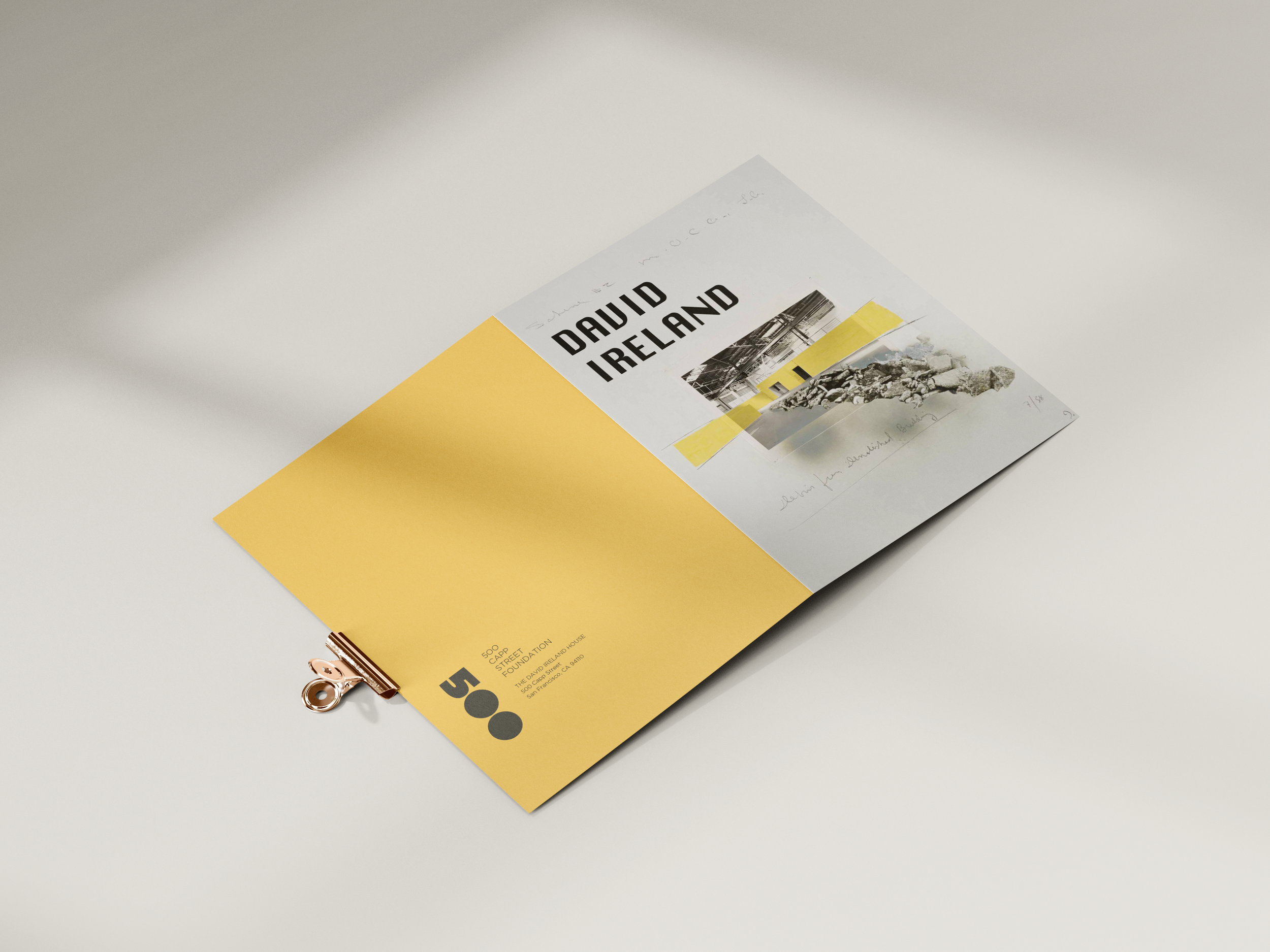
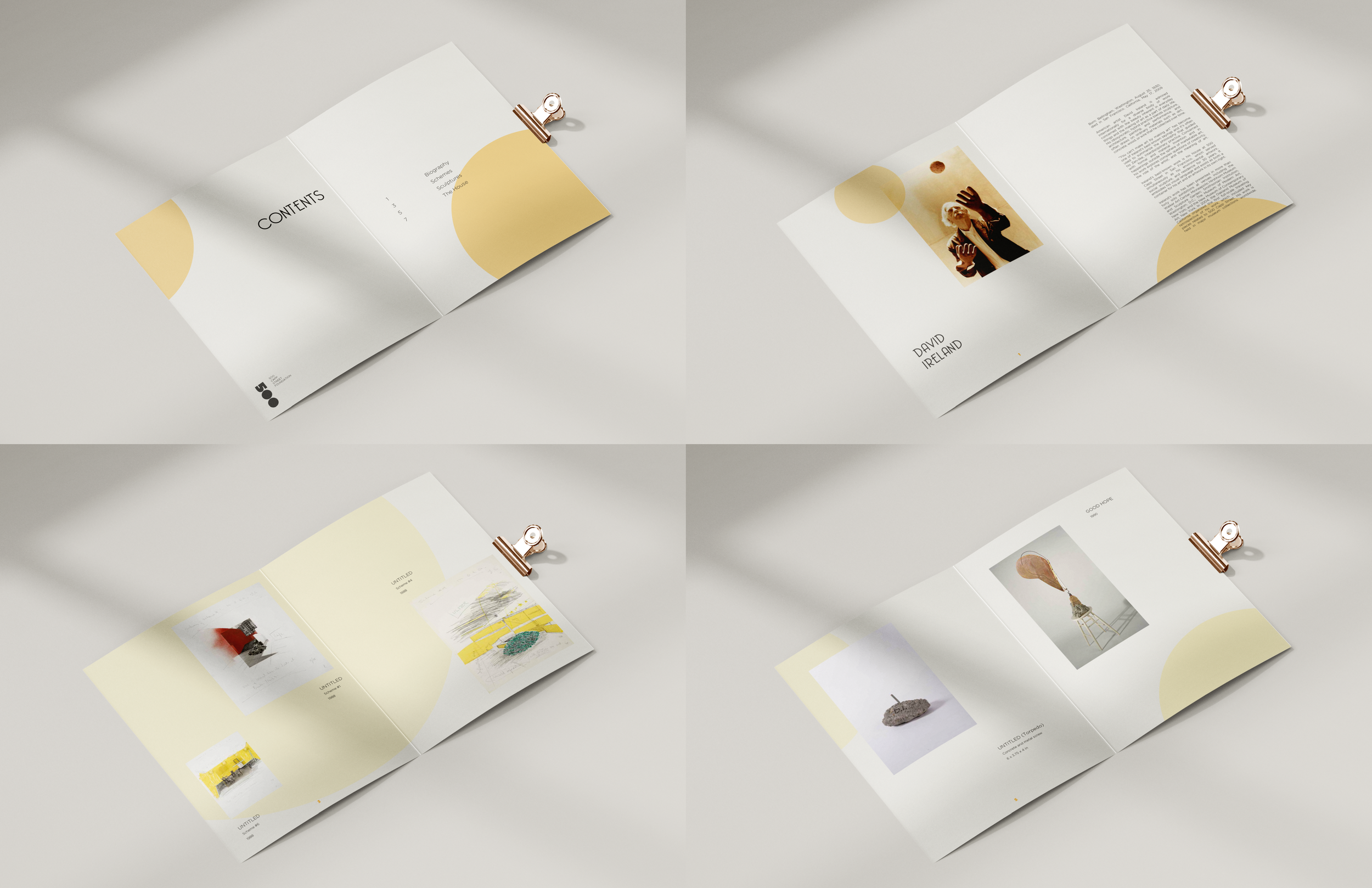
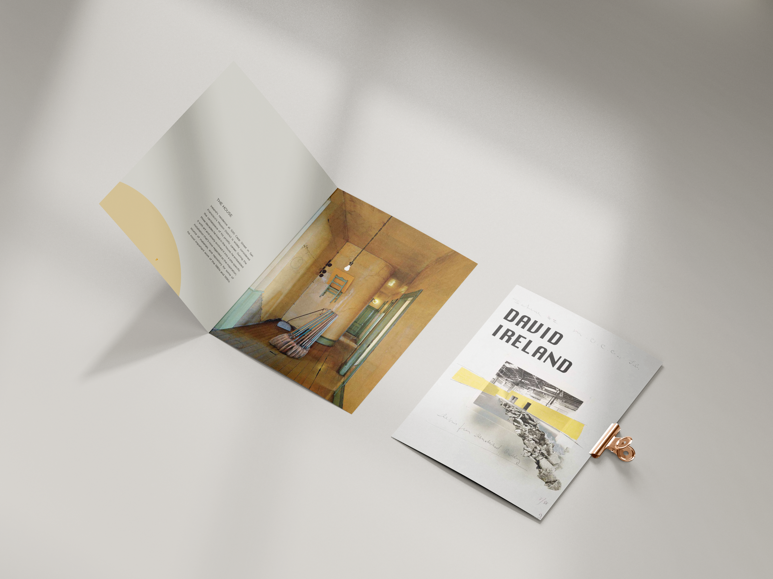
The App was designed based on the catalog. I used circles as a major element for the catalog design since their logo 500 contains two circles which stand for the zeroes. I didn’t adopt the circles for the App design because I thought on a mobile phone they could appear distracting since a mobile screen is a lot smaller than a catalog page.
